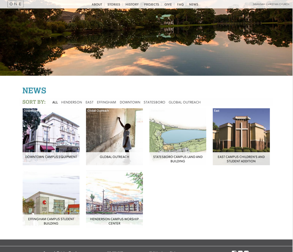
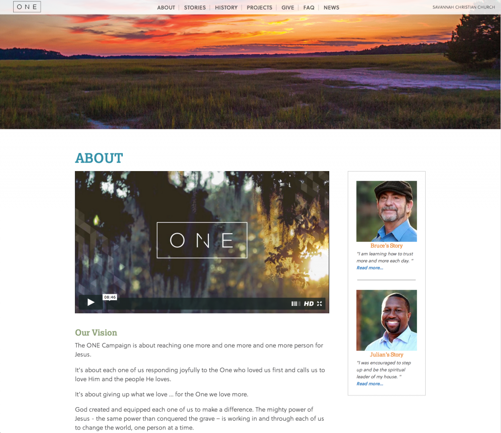
http://myonecampaign.com is a capital campaign site designed for Savannah Christian Church. We desired to encourage some exploration to view not only details about the campaign, but the driving force behind it of people and their stories. The end goal of the site is to be a hub for information by using the visuals captured for print and video pieces and posting news updates on the projects.
The Fine Details
That part of any project is attention to the details. The small quirks and often overlooked items really helps the project to stand out. While I won’t hit all the small things, I wanted to touch on a few.
Full Screen Video
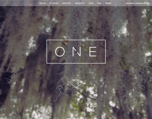
One of the first things you will probably notice if you visit the site is the use of a full screen video on the homepage. Now normally I cringe at any auto play videos, but because the feeling was achieved without any audio, out team felt it was an appropriate way to use the footage.
Parallax Scrolling
The usage of parallax scrolling (the latest hotness) is used on the homepage and on the headers of each page, to feature imagery shot for the campaign. Headers on all pages excluding the home page show a larger image initially and it slowly shrinks as the page scrolls down all presented with a subtle parallax effect.
Menu Invert
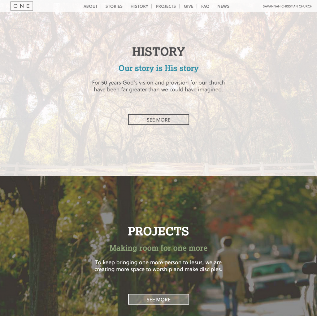
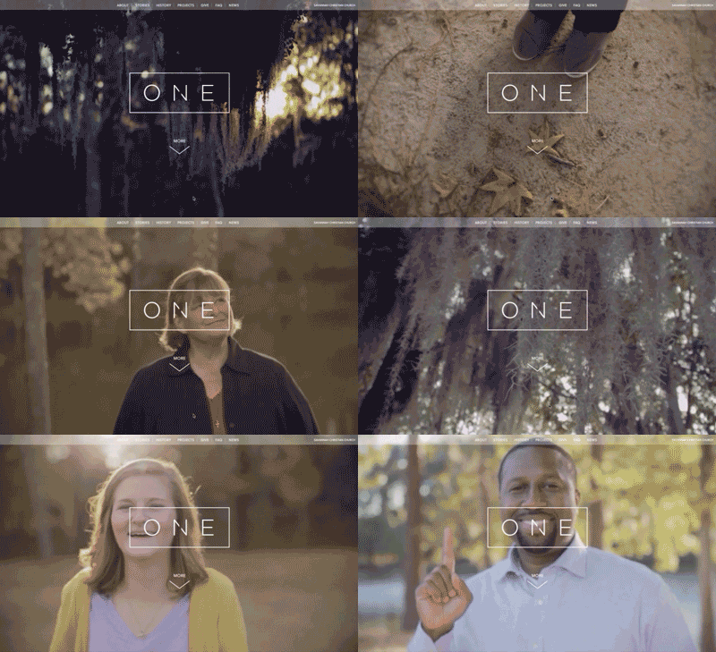
The homepage menu is intentionally more transparent on initial load to encourage some exploration. Scrolling past the first fullscreen video the menu will fade from its states. This is a pretty seamless transition and it will likely go unnoticed (which is a very good thing for this application). The screens below illustrate the initial image that changes transparency as well as inverting to black text.


Form Calculator
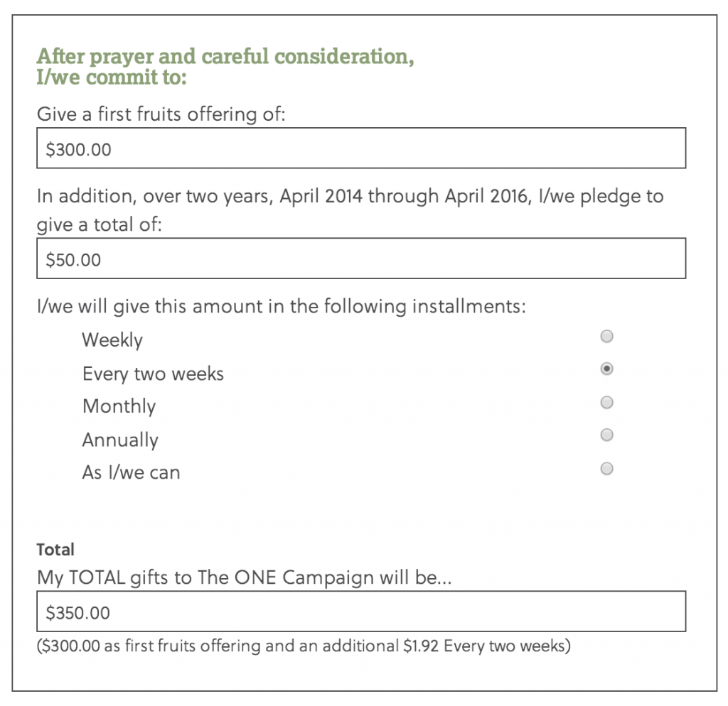
As part of the capital campaign there is also a commitment form to allow collection of information and the amounts people are donating, I did some hand javascript work to show users what their gifts would be for the time period selected.
Views and Layouts
My Thoughts
This project required a super quick turnaround time, of 8 days. Being able to re-use technologies that I had used in previous projects made this a tight but accomplishable deadline possible. Scripts such as skrollr.js, mixitup, fitvid.js in conjunction with using Bootstrap for layout and responsive base made this an extremely quick but rewarding project.
As with any project I would love to stretch my knowledge and skills by using new tools or techniques. As a developer I know this is not always possible and sometimes you just have to pound a project out, and this one turned out solid.

Leave a Reply